Sports
The funky font on Norway’s World Cup jersey? It’s inspired by Nordic runes
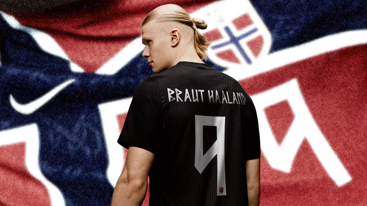
When Norway’s national soccer team first experimented with kits that used a font inspired by the runic alphabet, an ancient Scandinavian written language used by Vikings, it was too hard to read. Characters on Norway’s 2024 jerseys were jagged, sharp, and not easily discernible. On the country’s home kits, they were beveled and even more difficult to make out, baffling plenty of first-time viewers. Plus, they didn’t adhere to FIFA’s rules for the typography of World Cup kits to be “clearly legible and distinguishable from a distance” for players, officials, spectators, and the media. So for...
Read Full Article at www.fastcompany.com
Original story published by www.fastcompany.com. Peanutlife curates and shares uplifting news to brighten your day.