 Relationships
Did Coca-Cola take the ‘fridge cigarette’ too far?
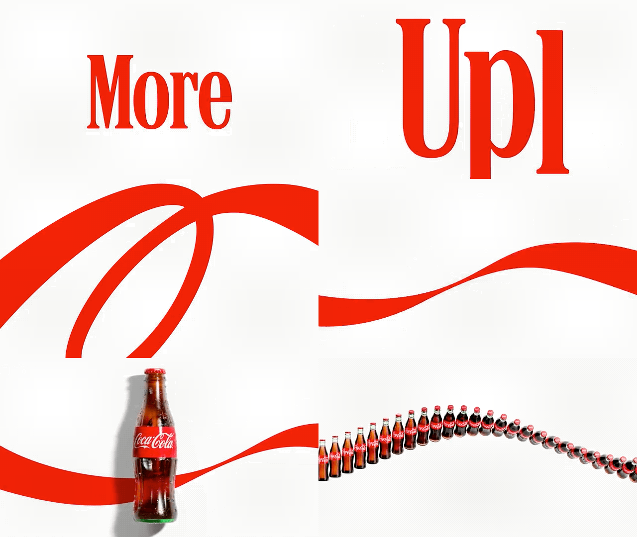
For any brand, a major redesign is a make-or-break moment. But for legacy companies with decades of clout behind them, the stakes are even higher. So when Coca-Cola unveiled a new global visual identity this week (it has not yet launched in the North American market), it also gave the internet something to talk about. [Image: Coca-Cola] Retaining its unmistakable 140-year-old red-and-white color palette, the brand keeps its original logo but rotates the “Coca-Cola” wordmark vertically on the can. And the logo color is now unified across all flavors. (Coke Zero, for example, used to feature ...
Read Full Article at www.fastcompany.com
Original story published by www.fastcompany.com. Peanutlife curates and shares uplifting news to brighten your day.


